The power of atomic design
Ventures, products, and services
2020

Changing the logic of digital products by changing the metaphor we conceive them with
Partly due to the evolutionary nature of this kind of product, partly due to our own propensity towards exploration, we like to continually explore with new tools and methods to sharpen our design processes; our goals being both managing ours, the stakeholders’, and the overall production’s time better, and increasing the final product’s quality.
With this piece, we’d like to talk specifically about the method we have adopted (and love very much) for a particular phase of the designing process: the realization — i.e. when things are put into practice.
(By the way, if you’re wondering why we say “we,” it’s because Nicola Gubernale and I have written this article)
What were our goals?
What we were looking for was a method to answer three key demands that make up the majority of digital products.
Robustness and future development opportunities
Creating products that endure the test of time, ready to evolve and adapt easily, without the need for a more massive and thorough redesign.
Efficiency and alignment
To make sure that a project can evolve quickly, it is necessary that some stakeholders (like designers and developers) can work on several tasks simultaneously, playing on a common field and speaking the same language.
Collaboration
Speeding things up for the team by creating the necessary conditions for it to be flexible, i.e. facilitating the integration of external contributors even in medias res, without compromising the consistency — and thus the usability — of the product.
Atomic design
We’ve long heard about Design System, and there’s a lot of supporting material like articles, semifinished products, and famous examples (Material Design, Polaris, Atlassian) on the web. What we needed, however, was a simple method to build something from the ground up.
And so, since we liked both the metaphor and the approach, we became attracted to atomic design — theorized by Brad Frost in 2013 — like tiny electrons.
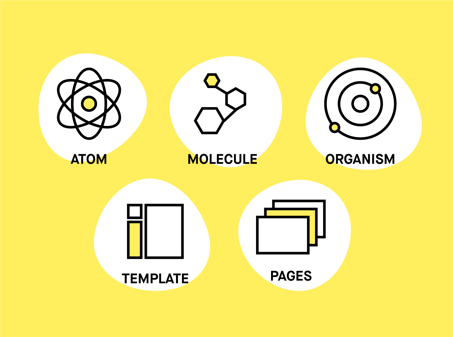
Atomic design is a design methodology that facilitates the creation of a design system thanks to the application of an organizational model derived from chemistry and based on the individuation of atoms, molecules, and organisms as fundamental building blocks of an interface.
The concept that subtends this organization is the so-called object-based modularity: the interface is broken down into its smallest components (atoms), which then aggregate in increasingly higher levels of complexity to first shape molecules (components) and organisms (macro-components), and then “pages,” i.e. groups of components arranged in accordance with a specific template.
“This operation facilitates the entire design process, because it helps pinpoint the individual problems hidden inside larger problems. Then, when those are solved, one by one […] they eventually recompose themselves in a coherent way, following functional characteristics for each individual part…”

The variety of digital tools with which we access the web is virtually endless, so we need to abandon the idea of a static page.
One of the main advantages of the application of this method is the passing of the metaphor of the static page as we have come to know it. The idea that the web is made up of “pages” has been incredibly helpful over the first few decades of the web: it was quick and understandable, as everyone knew what a “page” was.
Over time, however, the way we access the web has changed. Initially, we would surf the web on our computers; today, there is such an endless amount of tools and interfaces that this metaphor is starting to become limiting for designers and developers.
Atomic design offers us an alternative to the idea of a static page. Starting with the design of the smaller elements, all the way up to the more complex ones, we can handle each part of the interface as if it was alive, and thus define not just its aesthetical appearance, but also its behavior following the requirements — a 15-inch laptop will behave differently from a smartphone, and smartphones themselves have many shapes and screen sizes.
This both guarantees a certain level of consistency and stability of the interface in all its possible configurations; and, on the other hand, it facilitates the interaction between the designer and the developer, since, over the last few years, frontend development has moved heavily towards object-based frameworks to take advantage of reuse, both saving time and eliminating the need for some bug fixing.
Our experience with mentorXchange
In 2019 we had the chance to support a British startup, mentorXchange, which has allowed us to put the theory of atomic design to the test. As a startup, one of its needs was to quickly get its hands on a functioning product to show its users and prospective clients, with the dual scope of validating the business idea and further developing it.
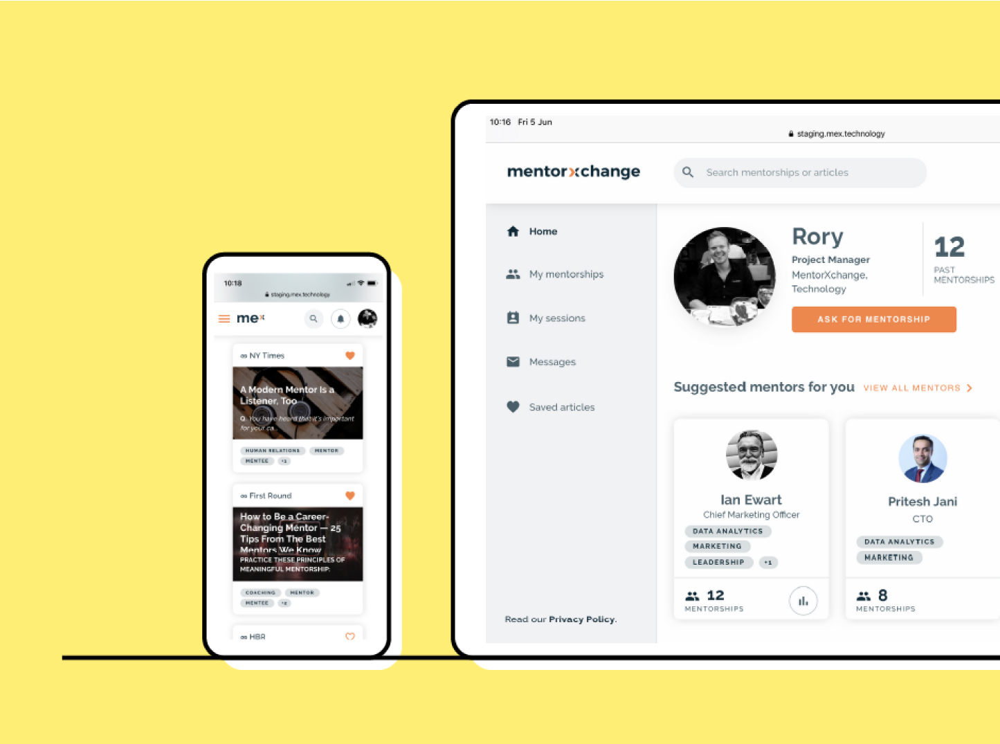
The mentorXchange platform
Through a web platform, mentorXchange fosters a collaborative and personal growth culture within companies. This product facilitates the creation of connections between colleagues of the same company, to exchange experiences and knowledge on specific topics: users can plan their meetings, give or receive feedback, access inspirational content, and track their own progress.
How did it go?
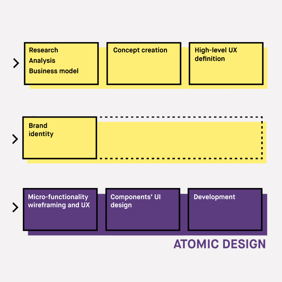
After co-designing the mentorXchange concept, business model, and the platform’s macro-functionality, the premise to work on its UX and UI were as follows:
- a tight schedule;
- the need to define functionality in detail, elaborate on the UX and UI, and bring overall development forward;
- the realization that we were only working on the product’s core, and that further development would have been passed on to other hands.
As we needed speed, flexibility, and modularity, we immediately thought that an atomic design-based approach would be ideal. In the following few paragraphs, we will describe this approach step by step.
Before the unbundling…
1 — First of all, branding
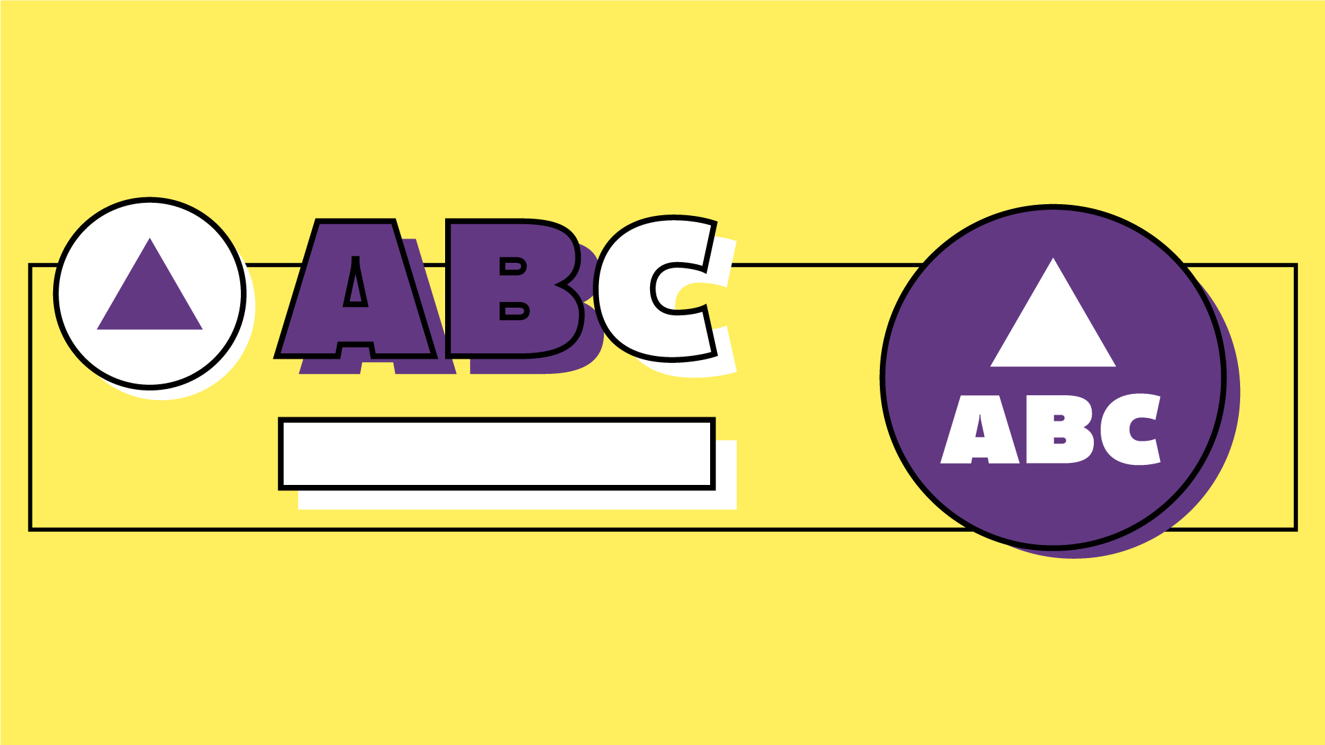
Before thinking about the design’s system, we focused our efforts on the branding phase to define the product’s identity: logo design, color palette, logotypes, tone of voice, the works.
Unless the client already has a brand manual, this is an essential activity, as it builds the framework inside of which our design system will work.
2 — A wireframe as a common map
Together with the brand design, we began to sketch the first wireframes based on the list of functionalities that emerged both through our research and the co-design phase with the client.
The wireframe was our primary tool to describe the UX flow, the behavior of micro-features, the information’s architecture, the templates’ structure, and the breakpoints with which the interface would reconfigure itself in accordance with the tool.

Wireframes often represent the most effective way to validate the UX of a platform with both the team and the client.
The level of depth wireframes have can be different depending on the project or the development phase. In our case, being this a platform with many interactions, we decided to dive deep into each detail, leaving out graphics only. As a result, we designed over 130 wireframes for mentorXchange. This has allowed us to share and validate each idea with our team’s developers and the client without stressing over the various screens’ aesthetics — and also saved us a lot of time.
…the unbundling…
3 — The particle analysis
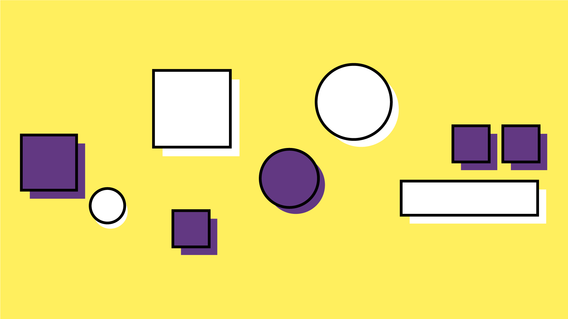
Once the wireframe design had led us to a satisfactory level and the client had given their green light, we began to shape our work on the design system by starting with the particle analysis. This means we analyzed the elements in the wireframe to pinpoint and list atoms, molecules, and organisms.
The secret ingredient of this activity was a rather synergic collaboration between designers and developers. Indeed, for it to be effective, the components’ list will have to match both the structure of the new design work (like the .sketch file) and the logic behind the code.
A little technical aside:
Methodologies like OOCSS, SMACSS, and BEM are essentially known for being naming techniques for the classes’ IDs. What commonly happens is that if generic names are given to different elements, and then, when CSS is used, a single style rule is written for one of them, the rule gets applied to all elements, including ones it wasn’t meant for. BEM, on the other hand, requires that we give a component an ID, like “header,” so that all things pertaining to HEADER will need to show the name HEADER at the beginning, followed by __ (two underscores) and then the element’s name (so the logo would be → header_logo). In this way, there is no conflict and there’s a higher degree of control over changes. This is why it’s vital to dedicate some of the initial time to system definitions.
…the composition
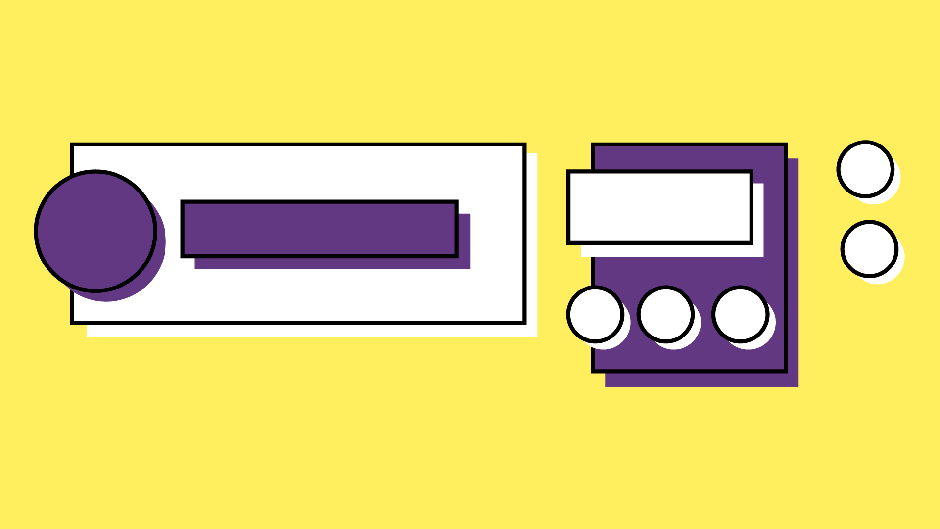
Here comes our favorite part: the rebundling of the interface, which means the design of UI.
4 — Starting small: particle design
Guided by Frost’s theories, we have started from the design of atoms, molecules, and organisms. In the meantime, we have built the style guide (logotypes and color palettes) and perfected the breakpoints and the template’s grids.
5 — Scientific demonstration: continuous testing
This process has, of course, been everything but linear, especially at the beginning. Indeed, as components got readied, we bundled them to recreate examples of “pages” with realistic content, to quickly evaluate their effectiveness and change them if needed.
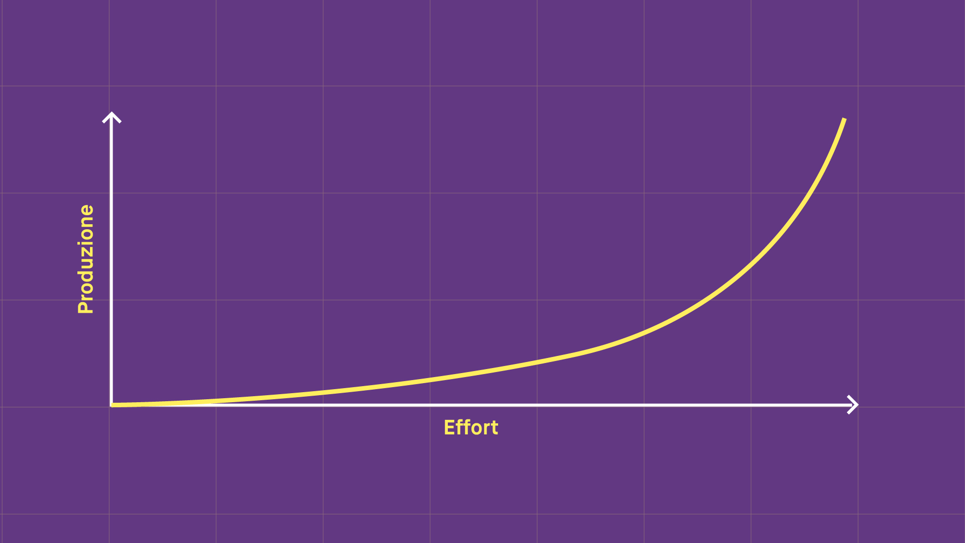
This methodology is characterized by an exponential curve between effort and work production. In the first phases of the project, we invested a lot in creating the design system and the basic elements (like the loader and the setting of the breakpoints). However, going on with the design, the implementation of new features and the necessary changes to existing ones become increasingly easier.
Why did we like working like this, and would we always want to do it?
The advantages we have seen in using this method have touched several aspects of the product and the project’s management, and have been precious for everyone involved: designers, PMs, developers, the client.
Product scalability
Even though it’s often abused or misused, the term “scalable” is the adjective that better describes the kind of product one can obtain working with atomic design. This characteristic allows to optimize future development times, and goes perfectly with an incremental approach that starts with an MVP and quickly brings the product to market to understand the users’ reals needs better, and base further changes based on those learnings.
Versatile solidity
Investing in the analysis and breaking down of the interface into atoms, molecules, and organisms has allowed us to create a robust yet versatile system, where all the parts are guided by a common logic. This has turned into a design process where, as we went on with the development, we could intuitively get:
- a better chance of reusing components;
- a notable reduction in bugs;
- a coherent UX and UI;
- a sensible speed improvement in welcoming new requirements and changing already existing functionalities.
A compact, open team
To use this method, it has been necessary for the whole team — designers and developers in particular — to work with object-based logic. Once this common language had been established, it was easy to collaborate from the get-go and define the various components’ granularity — and thus the founding elements of the product — together.
Thanks to these shared rules, we have been able to facilitate the interaction among team members (including new entries in the most intense moments) and generate an output that was both coherent with the client’s expectations and those of the team.
Scalability, versatility, speed, and aligned teams are essential ingredients for a startup’s survival. Still, considering the innovation context in which we are submerged, they have become paramount for the development of any and all digital products. And that’s why atomic design can be attractive for every kind of company.




 in Italy