Newspapers aren’t extinct
Print media needs to settle into a new role, changing its clothes accordingly.
by Francesco Franchi

If print is beauty bound—and it is—then I would like to change the rule. It should no longer be ‘ready to print’ but rather ‘fit to print.’ Let’s only print what is really necessary and worthwhile. Let’s raise the quality of physical newspapers: now’s the time. As we experience a total blurring of the boundary between paper and digital, we must remove the obsolete protection of the print edition, but we also need to reach beyond the ‘digital-first’ approach, which insinuates that the paper edition is a mere surrogate while it really should merely be an alternative channel for spreading information. I am thinking of the case of the New York Times, where the prevalence of the online edition has morphed the paper edition into a well-edited playlist, with the journalists’ best work carefully packaged by an editorial team to offer the reader an experience that is suitable for the physical product.
As a designer, I consider newspapers (whether in their print or digital form), ‘objects for everyday use.’ A newspaper is brought to life to meet a requirement: that of providing information to its readers. As its development goes on, its purpose becomes defined, it is designed and planned, produced, and distributed as a commodity. It is then classified in terms of consumer behavior and, lastly, experienced by its readers. The role of design is to endow this everyday product with a formal aura, one that is not artistic, albeit aesthetic, so as to increase the value of using it (since it is an interface tool) its formal value (exalting its ability to appear and its social and cultural roles) and its economic value, without affecting its functional value.
What makes a ‘thing’ an ‘object’ and upgrades it from being simply an ‘object for everyday use’ into a ‘designer object’ is its form. It is worth pointing out that first of all, editorial design has to respond to the aesthetics of logic, considered as a sort of harmony arising from its distinctive combination of function and usefulness, and then, the aesthetics of its form. Both should be considered criteria of the product’s quality, as differentiating factors, and also as a possible criterion of commercial success for traditional media in modern society.
The perception of an object reaches us through the perception of its form. Not the mere configuration of its outer appearance, but the language that makes it comprehensible in our community. Editorial design revolves around the function of communicating a journalistic idea or story through the targeted and combined use of words and pictures that organize and present information, transforming it into comprehension. It is the structure through which a journalistic story is read and interpreted (after the event, or simultaneously, under optimal conditions). Editorial design embraces both the general architecture of a publication (and its implicit logical structure), and the specific treatment of a story (how it is adapted to the logic of the publication, or how it attempts to breach its mold).
A daily paper, therefore, which at first glance might seem like an object with a defined and infinitely recurrent function, turns out to be multifaceted. It takes on diverse traits and appearances, depending on the situations it is called upon to perform. It lives its natural course of action, unraveling before our eyes in a never-ending evolution, while its graphic design does not change.
The newspaper, as an object, has found its place in time and space. The recent transformations of the information world have influenced newspapers and profoundly and influenced the habits of their readers, thus challenging both the identity of a newspaper as a product and its role in society.
Nevertheless, printed media hasn’t become extinct, and I am inclined to think that in this fast-moving publishing world if it delivers quality content and design, paper can transform our ‘objects for everyday use’ into luxury objects for an exclusive niche market.
So this is why I like to think of a project that unfolds along three different intersecting time axes, and involves both analog and digital platforms that complement each other, leveraging them for their specific properties, without mixing them, aware that they address different readers and will be used during different time slots throughout the day.
Imagine a newspaper that is at the same time hourly, daily, and weekly. The first part, hourly, could be like a column, a page section, or something that from the paper links you to the digital version. In the time that it takes to eat breakfast, the newspaper must be able to inform us about all the main news that we have to know that morning before we get to the office. Then there is the slower-paced daily part, that deals more with follow-up and comments. It escorts the reader throughout the day, and by evening it has not yet expired. Then, lastly, this ideal newspaper has a weekly part—a specific backbone of quality, which is different for each day of the week. A product designed for even more relaxed reading, that covers many topics to engage diverse niches of readers, and that can be pulled out and kept. Not an advertising-rich insert, like in the current approach, but a weekly, to be leafed through lightly, essential to convey alternative content.
Newspapers, as I said, are also physical items. They are displayed on newsstands, placed on tables or hung in cafés, folded up in pockets, or rolled up and stuffed into bags with a corner sticking out. This is why we have to take a designer’s approach to creating an object that catches and gratifies the eye (besides just appealing to the mind). It must be rich in details and reading levels, nice to look at, read, and keep. A beauty that belongs, in this case, to the design and not the object, which is limited to being reproduced indefinitely, every day.
As for the physical aspect of newspapers, their ergonomics must not be underestimated, especially in a time like this, in which new generations struggle to hold a broadsheet format and cannot turn its pages on public transit without infringing on their fellow passengers’ space.
The concepts of object and space also combine with that of distribution. It is here that the rules changed a few years ago. On the one hand, the habit of going out every morning to buy the paper is no longer very common among young readers, and newsstands don’t have enough hipster appeal to draw them in. On the other hand, city streets are full of cyclists in brightly colored uniforms with increasingly bulky bags, that can deliver all sorts of products in 15-20 minutes. So why not go back to door-to-door distribution, taking advantage of this widespread and thorough system?
Or why not consider a space where we can indulge in the luxury of configuring our own daily paper on demand and having it rapidly printed and bound? I don’t think this is a utopia. Newsstands, like daily papers, must reinvent themselves. A new era in retailing magazines and newspapers has begun. Tyler Brûlé, the founder of Monocle magazine, has been a pioneer in this: Kioskcafé is his idea of the perfect newsstand. In addition to coffee, sweets, and sandwiches, the menu offers papers on demand, with more than 2,500 titles from 107 countries, in 60 languages, and more than 300 magazines, including glossies and independent publications. However, for a paper, such a space, as well as being a place where its readers can find it, also offers an environment to propose live initiatives, and engage the public in debates, presentations, previews, and concerts.
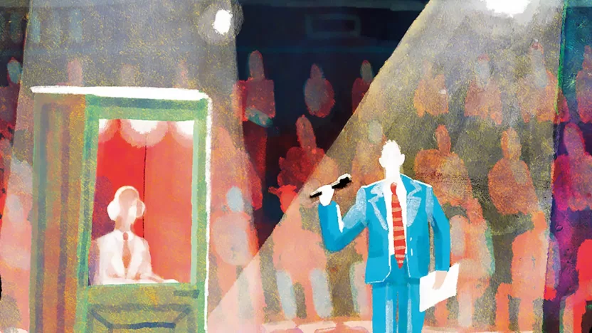
For example, many readers would be delighted to meet their favorite journalists. So why not suggest that the famous journalists of a newspaper play town crier for a day and use this space to tell their audience about their work?
Examples like this point out the need for brands to create and distribute experiences that are consistent and relevant for each user by exploiting multiple channels, emphasizing the importance of fully integrating among the paper, digital products, and physical space.
Let’s not forget the youngest readers. They are the audience of the future. Many papers are adding value thanks to supplements for children—full of high-quality illustrations, with creative graphics and typography. So why shouldn’t a paper’s influencers be teachers and educators? Morning lessons could very well start from the front page of a newspaper. I believe we should divert free copies from airport lounges to primary and secondary school teachers’ desks.
What I can say for sure is that for a designer, this is the most interesting and ambitious time to be in the newspaper market. We are living in a fascinating and stimulating moment; it is brilliant and intensely competitive; there have been no other similar periods in the history of editorial design. There are thousands of attempts, experiments, studies, and proposals in the current world of social media and the publishing industry as a whole. Each of us is called to lay down their cards, voice their vision, and offer their services. The years ahead will most likely bring exciting challenges in this industry, but at the same time, these challenges may perhaps dismay. Learning to reinvent ourselves is the most important thing we can do.


