Data Journey Crew: telling stories through data

Elisa Canini
Senior, UX designer
Research and insights
2021
How we designed an interactive dashboard that makes using datasets more efficient and data browsing more valuable through guided simulations and scenarios.
In some cases, the datasets at our disposal are not large enough to answer such granular questions or even ask the right ones. We have thus designed a data fusion process, by which we combine and enhance our clients’ datasets with other contextual datasets we find from third parties (like ISTAT, the World Bank, or OpenStreet Map). This mash-up allows us to answer specific questions more accurately and translate them into graphics reports that are easy to interpret and act upon consciously.
A common problem we have noticed is that this kind of analysis is often made on a per-need basis, starting from a blank canvas, both for the gathering and the processing of data from external sources and the final visualization of the results. This makes the job less efficient and does not allow us to maximize the experience and truly deliver on some added value for the client.
Therefore, there are two primary questions that our DJ Crew’s work is trying to answer:
- How can we standardize the process we use to produce our analyses, building a contextual dataset that’s intelligently summarized and easy to integrate with those of our clients?
- How can we standardize the creation of easily interpretable, actionable reports for the final user?
So, is the DJ Crew talking about music? Well, not exactly (that’ll be the Supersonic Crew). We are talking data here, so DJ stands for Data Journey. The Data Journey Crew wants to:
- Systematize the process of data gathering from third-party sources, so as to easily use and integrate it in future projects.
- Create a flexible, autonomously-browsable output capable of running analyses and simulations on top of a dataset that is always up to date.
The result of our “journey” in the world of data is thus a prototype of an interactive online dashboard that guides the user in the exploration of one or more interconnected databases, using simple, intuitive, interactive visualizations. These visualizations are not just pretty versions of excel sheets, but tools that enhance the perusal of the context — especially for non-data scientists.
Data Journey Dashboard: how we created our first prototype, starting from a real-world case.
The choice of a case study
To create our dashboard prototype, we first identified a case study that was useful in answering our questions. That is why we started with the example mentioned at the beginning of this article, the concluded analysis made for the insurance company mentioned above, which had asked us to help them understand how the launch of new products would increase their customer base in Italy.
The identification of the datasets and the two research paths
Working our way backward, we divided the data used for the analysis into data that was independent of the research context, such as territorial data or data from third-party sources (fixed dataset), and characterizing data, i.e. data given to us by the client (variable dataset).
The fixed dataset let us group the statistical measurements made on the field into macro-indicators describing the key features of Italian provinces, such as attractiveness, the level of mobility, and of innovation.
On the other hand, the variable dataset gave us business-related information the client already had, such as aggregated sales and personal data, which had insights into how the customer base was distributed across the country.
Following this step, we opened up two workstreams to actually create the dashboard.
First, we began to systematize the data gathering and synthesizing process for the fixed dataset, which helped us make that contextual database easy to expand and integrate into other analyses. How did we do it? We designed the software module the dashboard it is based on, so as to make it capable of constantly communicating with public databanks and retrieving and updating the necessary information constantly. This made it possible to create new macro-indicators and tweak existing ones, reducing the risks associated with manual tampering. The result is a system that can quickly adapt to the client’s needs, while the territorial analyses get a massive efficiency boost.
On the other hand, we identified the various scenarios; to wit, those mash-ups between fixed and variable datasets that bring the actual added value. In this case, the mash-up allowed us to define some hypotheses of commercial activity on the territory, and even look at a guided simulation of the impact of such activities. For instance, one of our client’s questions was: “What would happen if I launched a new car-related product in a high-mobility area?”.
Lastly, the dashboard’s design
The last step of our journey was — finally! 😀 — the design of the Data Journey Dashboard, which is the online, interactive platform that makes data and the analyses’ results browsable and actionable for the user (and reusable for us). The prototype is structured into two distinct journeys.
In the first journey, the user can explore the data in a guided tour, looking at how the fixed dataset is assembled from the synthetic macro-indicators down to the smaller micro-indicators they are made of. This is how we ensured maximum transparency.
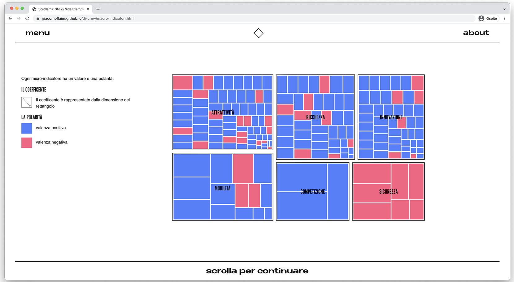
The dashboard’s interface in the first journey where it is possible to see the micro-indicators and their importance inside the synthetic macro-indicators.
In the second journey, the user is instead guided in the exploration of the different scenarios choosing which macro-indicators are used in the initial and ending phases.
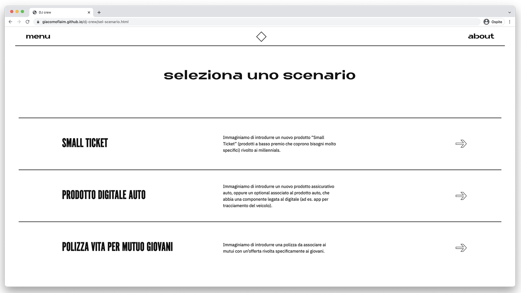
The dashboard’s interface, showing which macro-indicators have been selected in the initial phase (which territories is the new product set to address?) and then in the final simulation (which main indicators will guide its evolution?).
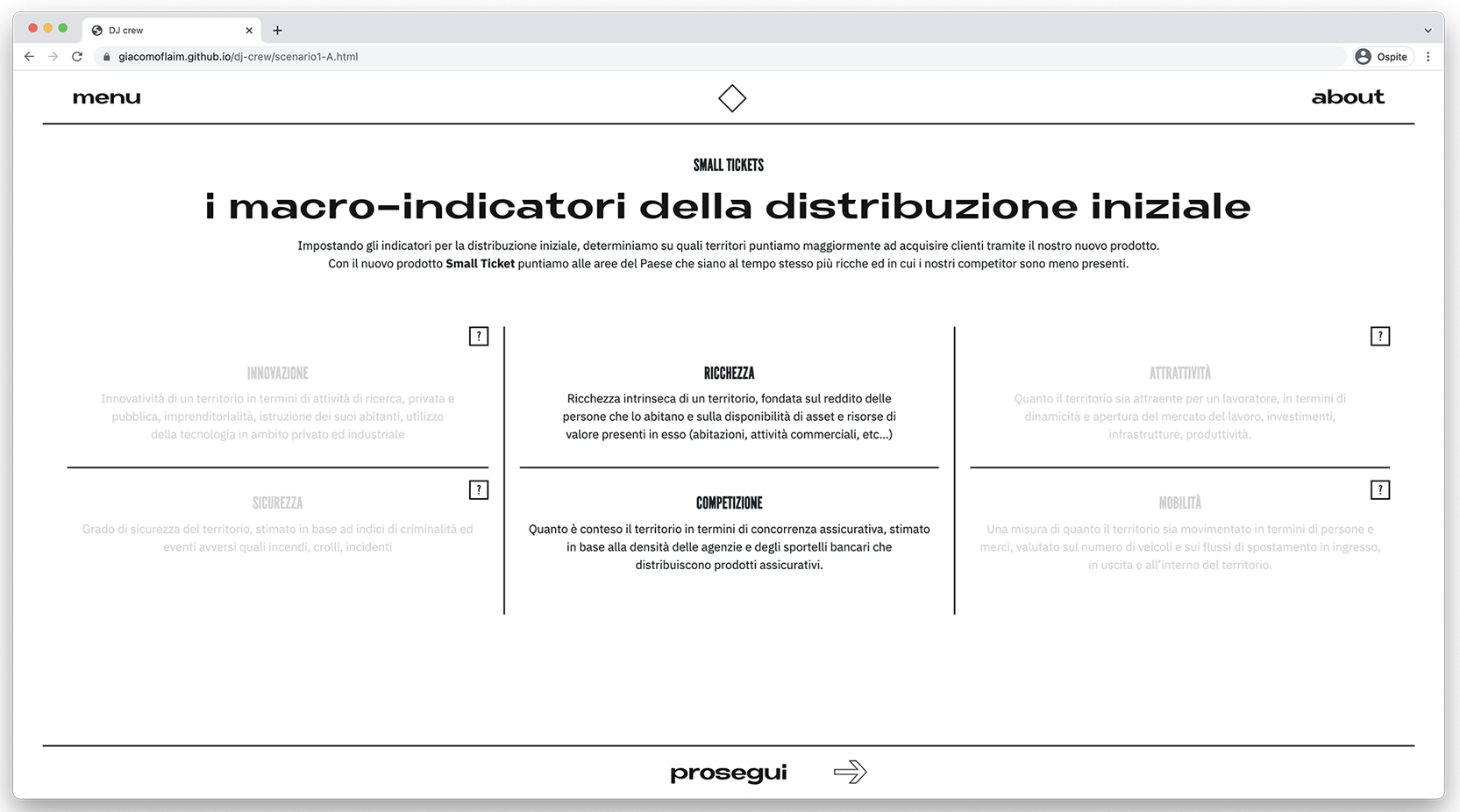
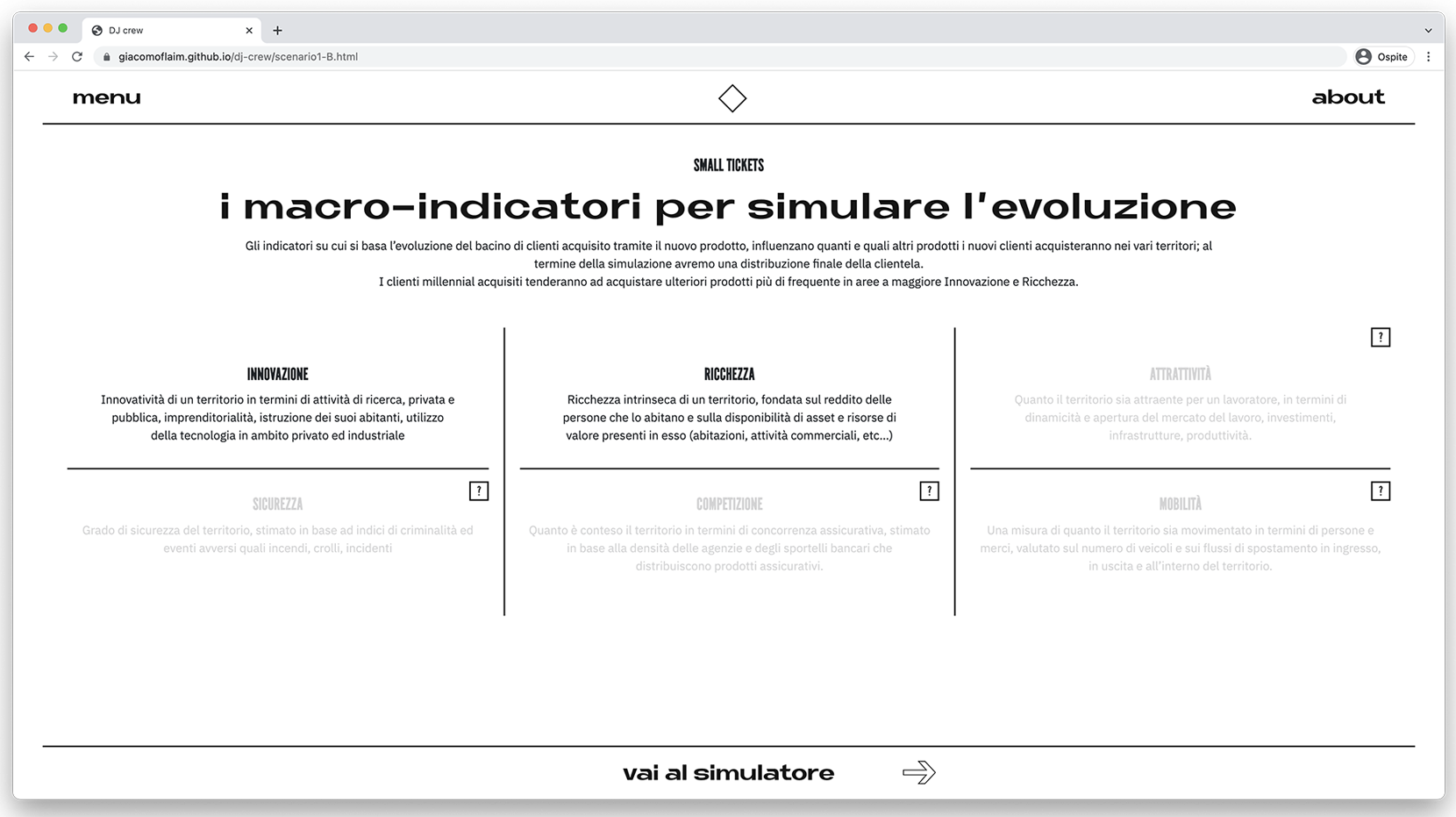
With these parameters in, the dashboard redirects the user to the scenario’s visualization, where three different visualization modes will let them autonomously explore the evolution of the scenario itself, as well as change the fixed variables (the macro-indicators).
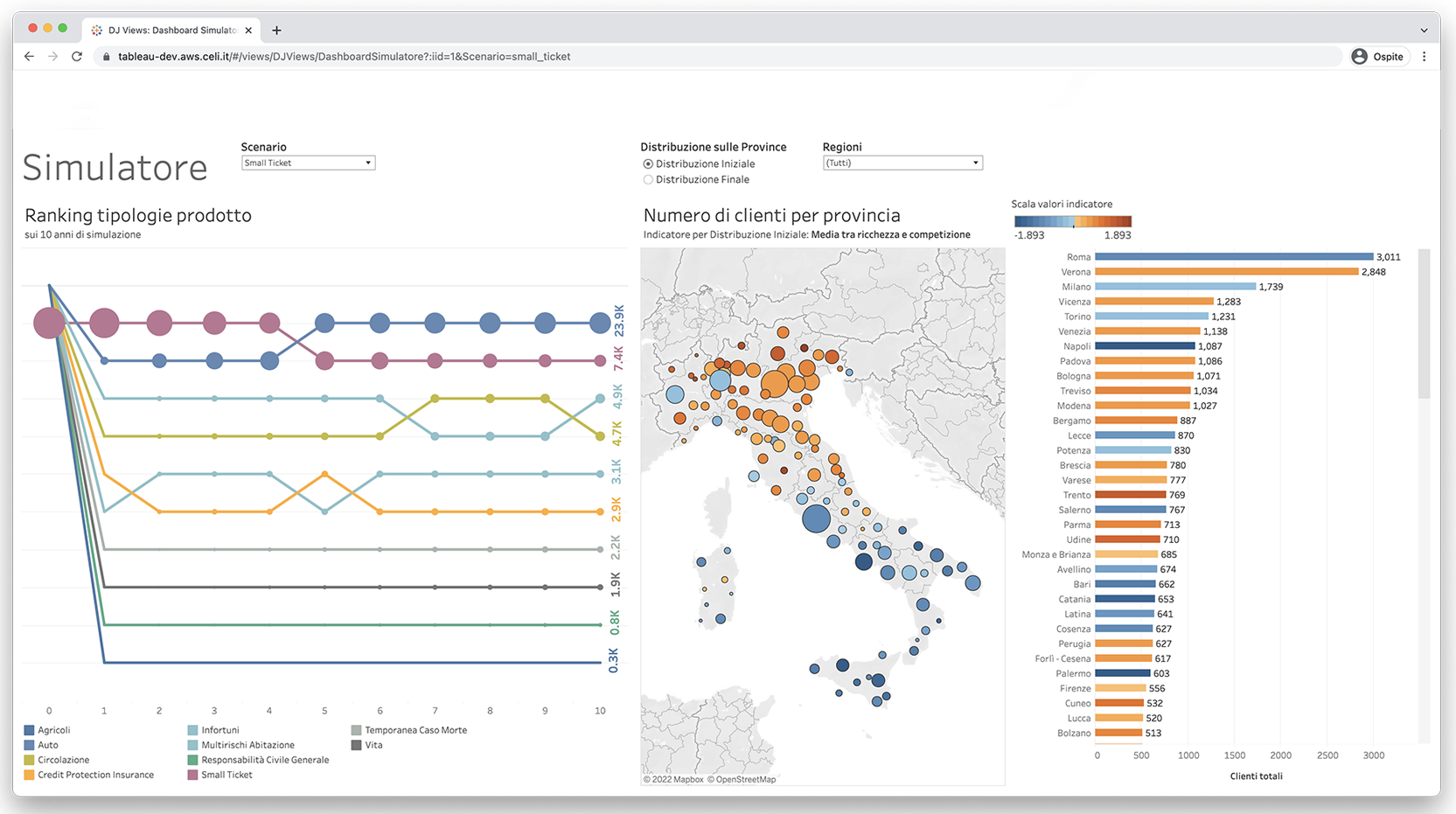
Interactive visualizations that allow users to explore the given scenario.
Conclusions
Of course, it would have been much easier to let you browse the platform yourselves instead of telling you how it works. However, the product is still in beta, and we don’t yet have a prototype to share.
The result we have reached is a prototype that has allowed us to answer some of the questions we had. The next steps will be focused on polishing the contextual data gathering system and expanding the interactive platform’s features to create a model that lets us make the most of the potential of data fusion processes.
